Solstice Presets for DSLR
Tips for optimizing the new Solstice Presets for desktop editing


Tips for optimizing the new Solstice Presets for desktop editing

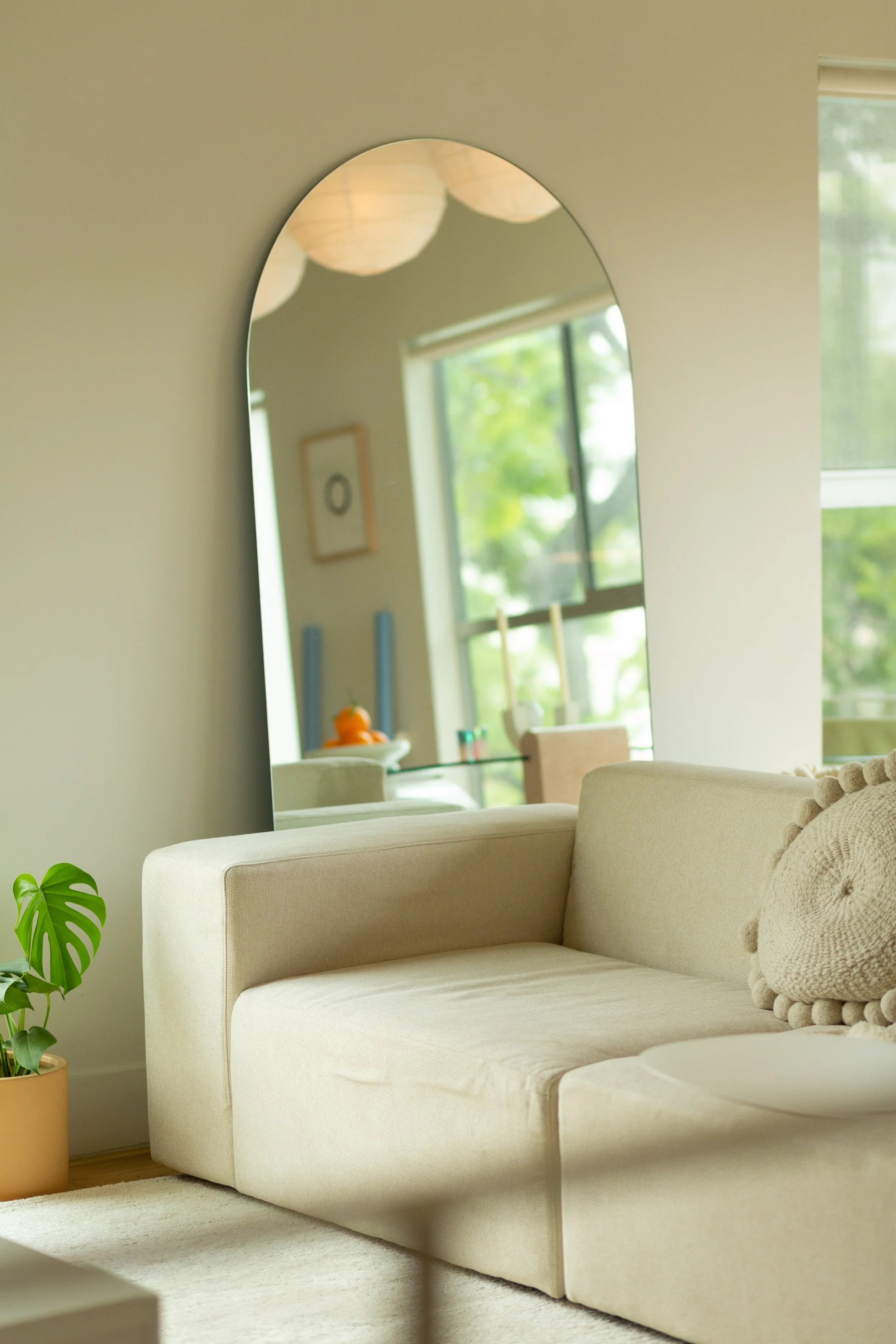
Hello! I hope you’ve been having a pleasant week so far. I’ve been looking forward to re-launching my Solstice Presets, (originally for mobile) this time specifically for desktop editing your DSLR photos: available now on my photo website!
Let’s jump into a few basics: for the most ease with editing, you’ll want to be working with well-lit, .RAW photos taken on your DSLR camera. These presets are not optimized for .JPGs, but the good news is that the mobile presets are!
Simply change the file format you’re shooting in on your camera settings to .RAW. (You can look up how to do this for your particular camera if you’re unsure where to find the setting.) .RAW files save the most information from your photos and are always easiest to work with across the board. Aside from that, you’ll need a basic understanding of photography and Lightroom to use the presets. As long as you’ve got properly exposed images, you’ll be good to go.

Each preset offers a fairly different look in terms of saturation, contrast, split toning and warmth. Overall, I aimed for them to be simple enough to tweak based on your lighting situation, and to create a cohesive look across your photos. There are 10 total presets to make these adjustments more simple. Let’s look at a handful of before and afters:

Before

After
the Above Preset: Blossom
Blossom is my everyday preset, I use this one the most on landscape and outdoor photos. I love the muted highlights and soft, pastel colors found in this preset.

Before
After
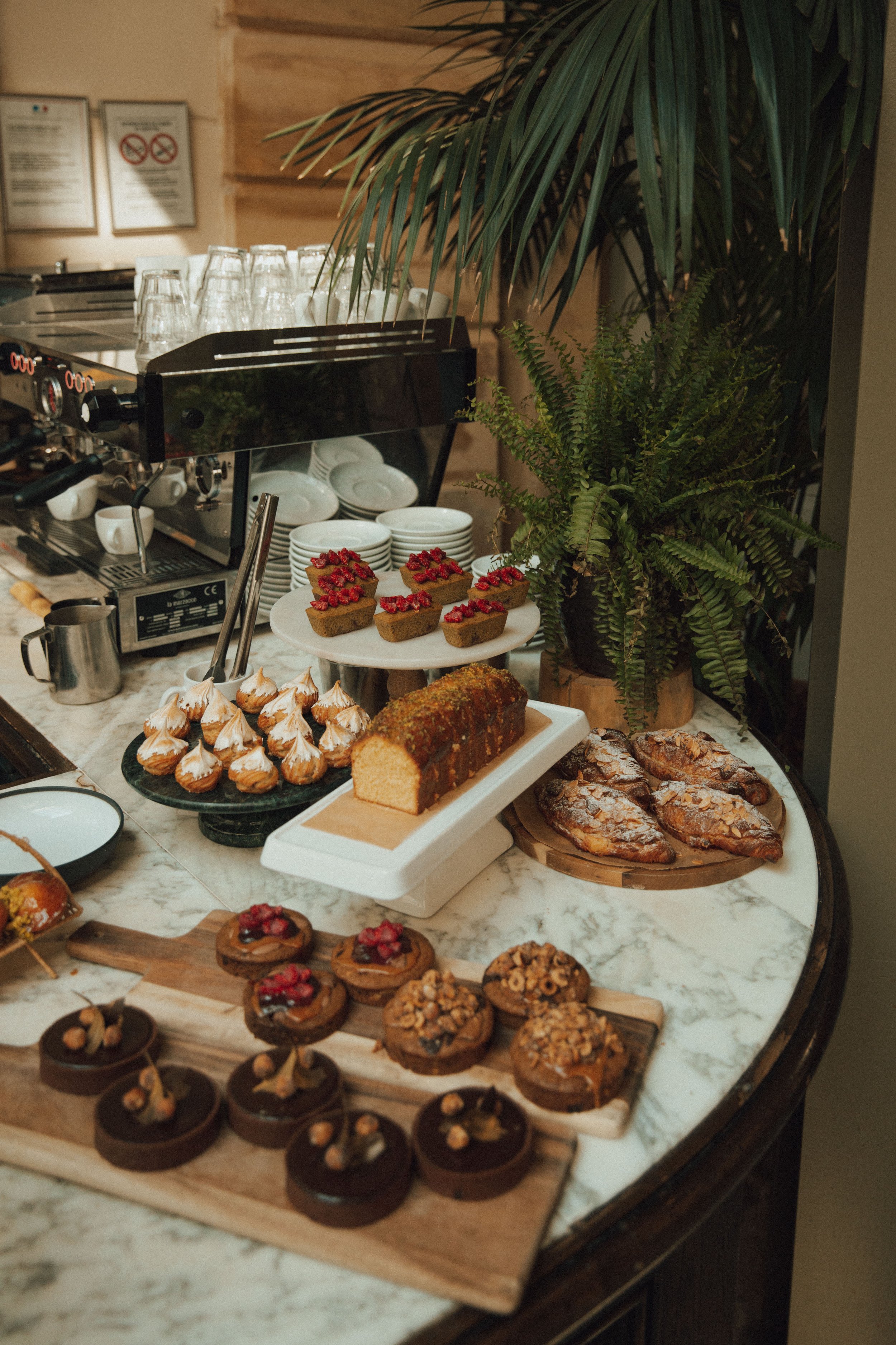
THE ABOVE Preset: Resplendent
Resplendent works well with indoor photos since it bumps the shadows and softens natural colors with some pastel pink-toned highlights. I enjoy using this one on food and plants, as you’ll see here.
Before

After
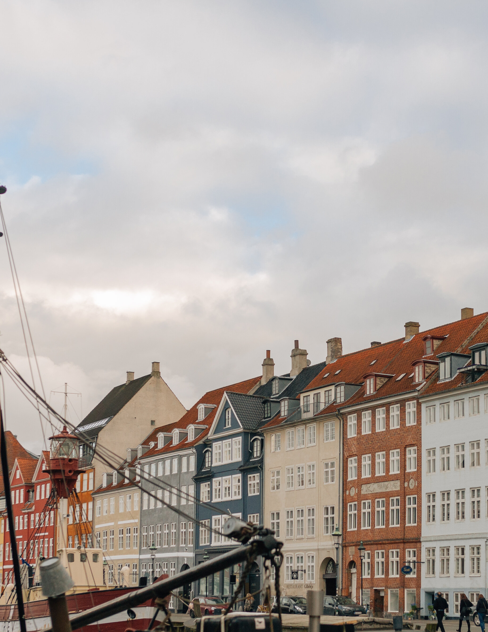
THE ABOVE Preset: Éclaircir
Éclaircir is ideal for harsh light and deep shadows. These photos were from an afternoon when the clouds disappeared and direct sunlight came out - there were mostly brown tones and dark shadows and this preset brightens the image and feels fairly retro, which is an added bonus.

Before
After
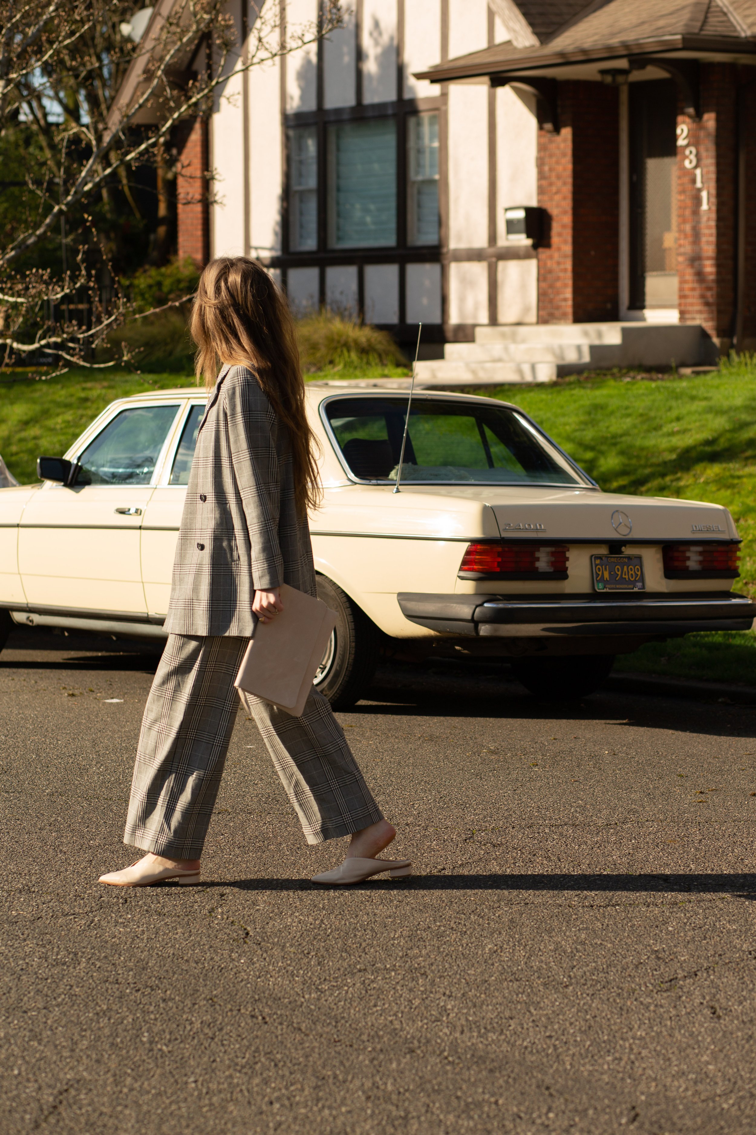
THE ABOVE Preset: Lavender
Lavender offers a light, dreamy tone to photos: it brings out cream colors and makes photos feel airy.

Before

After
the above Preset: Haze
I like Haze for harsh light and softer tones: this was taken on a bright day in Baja and I love how it softens the reds and shadows here.
Before

After
THE ABOVE Preset: Golden
Golden is my most-used preset, both on desktop and mobile. It adds a subtle warmth and mutes the highlights which I really enjoy for all lighting situations!

Before

After
THE ABOVE Preset: Glow
Glow is lovely for toned down highlights : I like using this one on photos that are a bit too warm, often taken during golden hour. It’s my go-to for product photos due to the smooth glow that the highlights create.

Before

After
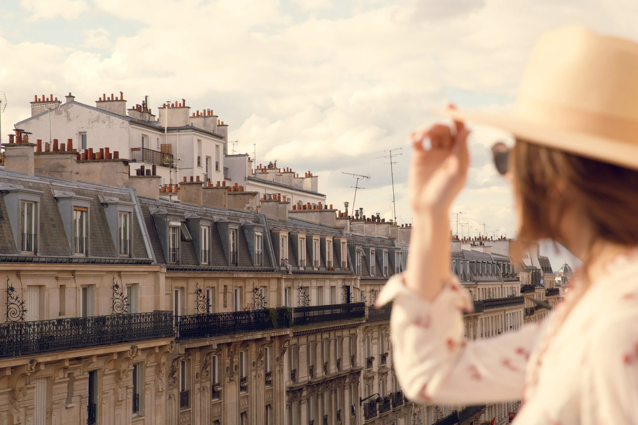
THE ABOVE Preset: Eve
Eve leans into the shadows and offers an idyllic tone for blue skies: I like using this one for bringing the warmth out of skin tones and deeper hues from the sky.
On all of these images, only a few minimal tweaks were made. Most often I change the exposure and contrast, since lighting changes so often in outdoor settings. Please let me know if you have other questions about the presets, and feel free to shoot an email this way if you’d like my team to do a few test edits for you!